Right from the beginning of the Russell Quant series I knew that cover image was going to be important. Making cover decisions for the first book of what you hope will be a series can be daunting. This will be the first face you put forward to the public – even before your own as the author.
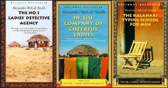
As a reader I’ve always liked it when series book covers have a common theme. Not only does it help make the books readily identifiable, it makes good marketing sense. Plus the books simply look better together on the shelf that way. Right now I think one of the series that does this best is Alexander McCall Smith’s No. 1 Ladies Detective Agency books. Not only do the book titles bring a cohesiveness to the series, so do the very distinctive book covers.
I suppose with eBooks this may become less important? I’m not sure about that – but that’s a discussion for another time.
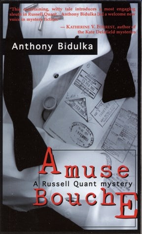
After a few missteps in developing the cover for the first Russell Quant book – good-bye puke green back ground – good-bye pair of wedding rings obviously for a bride and groom instead of the groom and groom featured in the storyline – I begged and pleaded and my gracious publisher finally gave me a chance to come up with some cover concepts that would be better suited. This was waaaaaaaaaaay long ago and I had just gotten my first digital camera. I spent a weekend with the camera, my tuxedo shirt and tie, a gun, some bullets, my passport and voila! I came up with what eventually became the cover image for Amuse Bouche: A Russell Quant Mystery.
Just for interest sake…several years later when this same book was being translated to be sold in Turkey, here is the cover they came up with (along with the rough Turkish translation for the title):
I’ve been quite happy with our choices for cover images throughout the life of the Russell Quant series. We did make a couple of small adjustments here and there. For instance, with the first two books we were going for a very stark modern image. We used a limited colour palette of black, white, grey and red. With the third book, Tapas on the Ramblas, we added vibrant colour and stuck with that ever since.
Another thing we played with was the font. If you look closely at the first book (original edition) the font is slightly different than what we used on the subsequent books. (see above the “A” in Amuse Bouche vs the “A” in Aloha, Candy Hearts)
Going full circle, here I am again at the start of a new series. The first book in the Adam Saint series will be released spring 2013. Cover decisions are soon to be made. I want the Saint covers to be unique, a departure from what we’ve done up to this point, something that really shows that these books are distinct from the Russell Quant books.
As such, I’ve been thinking about a lot about book covers lately and decided to put up a new poll on my website asking the question:
What most attracts you to a book cover?
So, if you get a chance, please go to
and register a vote. For those of you who have voted before, you’ll notice I’ve now allowed respondents to select more than one of the choices as your answer (by popular demand). If you haven’t been to my website in the last month or so, this will also give you a chance to see the recent revamp of the site which now has separate sections for Russell Quant and Adam Saint.
Thanks and happy voting!


